So, as the artistic member of the company I took on the task to redesign the company identity starting with the logo. The company never really had a "logo" per se. My father's business cards were pretty generic and he used a line drawing (wood cut) from unknown origins.

The image is very hard to make out but it is an old mill with a water wheel. Something my father has always been very partial to and which has been the "logo" for the company for years. In the lower right is a francis turbine to show the more modern side of the business.
Knowing that I had to satisfy my partner and my father (who started the business) I attempted to stay close to the concept of the original "logo". This was the first attempt that my wife and I put together. We really do a great job of refining each other and while I took the lead on this I definitely could not have done it without her critical feedback.
Trying to convey the waterwheel idea while staying iconic. It was a reasonable start but I got some great early feedback from a Design Director I respect, "It's not there yet." So we kept going with it. I morphed the waterwheel into a francis turbine yet kept it's placement to convey a waterwheel idea. It was okay.
Still not there and the feedback from my partner was a wish for a kaplan turbine. Most of our machines are kaplan turbines and he felt we should represent that on the logo. The kaplan style would not work in place of the francis in this logo and I was really feeling like this was a dead end. So I started playing with ideas in totally different directions.
So this one was something I sketched up on my ipad using flipink. I was playing with the idea of using a dam but was struggling with how to convey the "power house" aspect of the dam (where the tubines are). My wife suggested the subtle outline around the text which I liked. It actually took me down a new direction.

So we added some turbines back in. I took some extra time and refined the francis turbine to be more realistic. I'm still a bit on the fence as to which I like better visually. You can see the Kaplan turbine now in there on the right and we're focused more on the logo type rather than a pure icon. I liked this look and was hopeful that it could work. The feedback was that my father wanted me to try to incorporate the house/mill aspect back into it. sigh
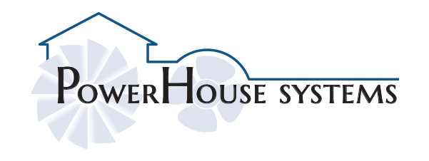
So a few more iterations and we arrived at this. Everyone's happy with it and I feel reasonably good about it.
I like how it looks on the business cards.

And I've come up with some ways of integrating the idea into other styles. Since I'm getting cards from Moo I've opted to get pictures on the back and I'm really happy with how they came out. Here are a couple of examples.


So it's been quite the adventure. I started playing with new logo ideas back in April or May and here we are in July already. Business cards have now been ordered and we'll have them for the HydroVision conference at the end of the month. Now on to the website. It would be nice to have something there so when people look at the card they won't hit an "under construction" page. :)
I can't thank my wife enough for her help on this project. You always get tons of feedback when doing this type of thing but it's rarely constructive. She's so awesome about pushing me that little bit further and I respect her comments. She always helps make it better.
